Color Palette
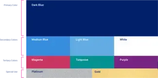
Primary Color
Our primary color is dark blue, matching PMS 280 C, which is also a prominent part of Columbia University’s secondary color palette. By emphasizing our connection to Columbia, the color reflects the rigorous education that our students receive and our purposeful tone of voice.
This color is appropriate for all text and graphic uses, and should be the default color for body copy on light backgrounds.
Secondary Colors
Our secondary colors provide tonal accents and are appropriate for use in infographics and other graphic elements. They can also be used for subheadings and display copy on dark backgrounds. However, use white as the default color for body copy on a dark background.
Tertiary Colors
The tertiary color palette is unique to SPS. The magenta, turquoise and purple infuse our identity with vibrancy and relevancy, and can be used for graphic elements, illustrations or buttons in web applications. While they can be applied for high-impact messages where sufficient contrast permits, use them sparingly.
Special Use
For formal or celebratory occasions, these metallic accents can be used with our primary dark blue to create a more premium look and feel. However, avoid applying the gold and platinum with our tertiary palette.
Color Values
Use these values when specifying colors for vendors, setting up digital documents and designs, and for print materials.
Dark Blue
PMS 280 C
C100 M70 Y5 K55
R1 G33 B105
HEX #012169
Medium Blue
PMS 279 C
C68 M34 Y0 K0
R0 G158 B255
HEX #009EFF
Light Blue
PMS 284 C
C59 M17 Y0 K0
R108 G172 B228
HEX #6CACE4
White
C0 M0 Y0 K0
R255 G255 B255
HEX #FFFFFF
Magenta
PMS 7635 C
C0 M90 Y25 K8
R212 G40 B91
HEX #D4285B
Turquoise
PMS 2461 C
C78 M8 Y45 K9
R37 G155 B154
HEX #259B9A
Purple
PMS 2612 C
C67 M100 Y0 K5
R123 G42 B141
HEX #7B2A8D
Color Systems
- PMS: The Pantone Matching System provides unique color IDs to specify color-matched inks ("spot colors") used in offset press printing, and in some apparel and promotional item manufacturing.
- CMYK: The 4-color ink values for most printing, including digital and offset. This palette has the most limited color range.
- RGB: The 3-color system used to specify on-screen colors. This palette has the widest color range.
- Hex: An alpha-numeric system used for specifying RGB colors, most commonly for the web, but also for applications found in Microsoft Office and Google Workspace. Often this is the quickest color value to copy-and-paste into these applications.
Web Accessibility Note:
Please contact spsweb [[at]] columbia [[dot]] edu (spsweb[at]columbia[dot]edu) if you have questions or need specifications for brand-compliant accessible colors to use when building web-based UI and content.